Pages

Monday, 17 August 2015

Bridges

Bridges is a restaurant built on a pier on Granville Island.

It was amazing to sit at the edge of the pier, eating a very delicious hamburger and enjoying a glass of BC wine. Quail's Gate is my absolute favourite.

From Bridges, and how I think it got its name, I could see both the Granville Street and Burrard Street Bridges. As a bonus, my vantage point was perfect for watching the Little Blue Ferries come in from English Bay. I was also treated to a view of many a sailboat. Wow. Do they make some of those boats big.


The sketch for this layout is from Scrapmuch? and was designed by Laura Whitaker. The mixture of rectangular and circular elements worked perfectly with the triangles on my background paper.
 
As I try to compete my 2012 vacation album before I take my 2015 vacation, I'm grateful that Scrapmuch? has a sketch every Friday to help feed me the inspiration I need.

 
It didn't take much by way of embellishments but the treasures I found in my mishmash of embellies were just the ticket.

 
For my next page I think I'll use the new sketch at Stuck?! Check it out.
 

Thursday, 13 August 2015

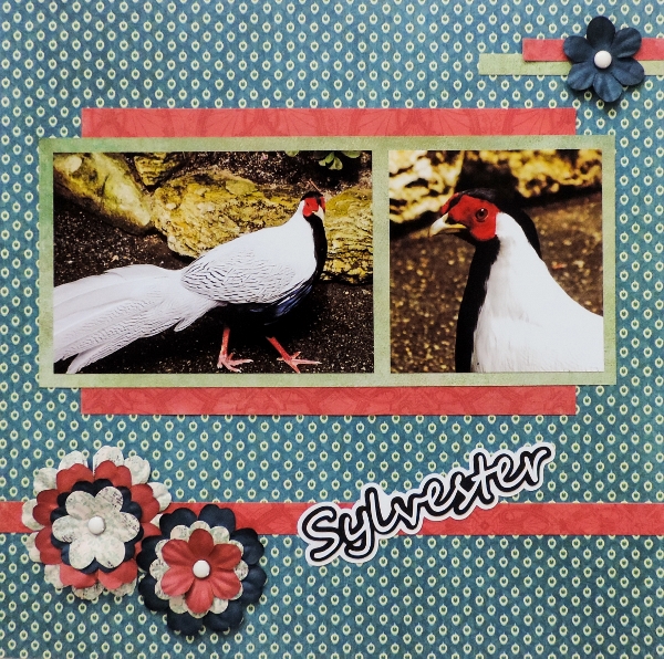
Sylvester

If there was ever a bird with an attitude it's Sylvester, a Silver Pheasant native to China.
 
A long time resident of the Bloedel Conservatory in Vancouver, he walks freely throughout the myriad of pathways stopping foot traffic for the odd preening session or a nap. If he's in the path you have to back track to detour as his tail feathers are so long there's no way around him.
 
He's a pretty bird and he knows it. He will often stop a group when he sees a camera.
Poultry or not, he's a bit of a ham.


The inspiration for this layout came from the Lasting Memories challenge #254. The challenge is to use the provided sketch and add something with wings. Sylvester seemed a perfect winged specimen to use. Be sure to link up your sketch by the 28th of the month to be eligible for the draw prize.


Next week Lasting Memories continues its "Sky High" theme a challenge to create a page with a starburst or sunburst.


Monday, 10 August 2015

Whistler Blackcomb

My most beautiful view of the Rockies came when I saw the Whistler and Blackcomb mountains together. From my vantage point they looked incredible, their majesty silhouetted by a brilliant blue sky. Truly an awe inspiring sight.

 
I so enjoyed working with this August 7th sketch from Scrapmuch? designed by Laura Whitaker. There's a great double page layout at Scrapmuch? as well. Complete and link up any of their August sketches by the end of the month to be entered into a draw for a prize. It's always fun to win a treat.
 
I really liked this sketch.
I'm a little bit of a circleaholic so the circular element really appealed to me. The circles also mirrored the rounded peaks of the mountains.


I flipped the sketch on it's side and it worked perfectly for my panoramic sized photo.
 
 
This was the suggested layout. It looks so different than it did when I rotated it. I think I'll do the sketch again, this time in the suggested orientation. It's just struck me that maybe any number of sketches could be rotated to give a totally different look. Maybe each sketch is really a '2 for 1' deal.


Thursday, 6 August 2015

Homeward Bound

The piles of photos from my Vancouver 2012 vacation are getting shorter by the day. There may be light at the end of the tunnel after all. :)

I decided to jump to what would be the last page in the album. This last page was to mirror the first in the album so it would also feature the outline of the province I was travelling to, its provincial coat of arms, and my airport and aeroplane souvenirs.  I changed the outline and button to Ontario, sent the plane flying west and the departure airport photo to Vancouver. It just all came together for me.

 
I played along with two challenges with this layout.
The sketch was the August 3rd sketch from The Memory Nest. It fit the horizontal stretch of my items to a 'T'. The Memory Nest has several challenges a month. They are released on Mondays. I only recently discovered this site but will definitely be back to play again.
 
 
The other challenge was #253,  "Sky High", the week one August challenge from Lasting Memories. Each week they will have a challenge based on the "Sky High" theme so check back. This week it was to be something that signified "Sky High". I thought my aeroplane flight would be just the ticket (pun intended).

When I put the first and last pages together I was very happy with the 'start' and 'end' of my albums.

Off to Vancouver
Back to Ontario


Wednesday, 5 August 2015

Gastown

I love going to places that have an interesting history and are just that little bit different. Gastown is that kind of place.

Gastown was Vancouver's first downtown core and is named after "Gassy" Jack Deighton, a Yorkshire seaman, steamboat captain and barkeep who arrived in 1867 to open the area's first saloon.

Gastown's most famous (though nowhere near oldest) landmark is the steam-powered clock on the corner of Cambie and Water Street. It was built in 1977 to cover a steam grate, part of Vancouver's distributed steam-heating system, as a way to harness the steam and to prevent street people from sleeping on the spot in cold weather.

I found a seat on patio of the Lamplighter Pub across the street. I thought it idyllic to be sitting in the sun enjoying great food and a beverage, and listening to the steam clock play the Westminster Chimes every quarter hour.


The inspiration for this layout came from the August 1st Stuck?! sketch designed by Laura Whitaker. I wanted to feature the steam clock picture and, as I am prone to do, tell a little about the subject I'm scrapping. This sketch did all that for me so all I pretty much did was follow right along with it.
  
 
I decided to use a solid circle. I knew the idea of the stitching would add to the layout so used gold jean thread, which is a thick thread that shows up well on paper, and outlined the circle. Unfortunately this thick thread only comes in gold and denim blue. It's great to work with and not only is more prominent but adds texture to the layout.


The journaling and title was fun to do. It took a few drafts before I found the right line breaks to accomplish the slanted look. I loved the suggestion of breaking up the journaling with use of the title.